
The Rise of Micro-interactions: Enhancing User Delight
The Rise of Micro-interactions: Enhancing User Delight
— By Godwin Okwong
Have you ever tapped the heart icon on Instagram, only to see it pop with that cute little animation? You probably smiled, even if just for a split second. That tiny interaction gave you a spark of joy, didn’t it? Of course, Pixar Animation Studios is one of my favorite animation producers for this reason; not because I am so in love with Toy Story, nor is it because Coco helped me sharpen my Spanish, but because of that intro animation of a jumping bedside lamp bot.

That, my friends, is the magic of micro-interactions. They’re the tiny details in design that you barely notice but would miss if they were gone. Like a good sprinkle of seasoning in your favorite dish, micro-interactions take something that’s already good and make it unforgettable.
But what are micro-interactions, and why do they matter? Let’s break it down, explore some real-life examples, and have a little fun along the way.
What Are Micro-interactions?

Simply put, micro-interactions are small, contained moments in a product that accomplish a single task.
Think of the delightful animations, sounds, or visual cues that happen when you complete a simple action — like tapping a button, pulling to refresh a feed, or switching a toggle. They’re the little high-fives of the digital world, subtly cheering you on.
They might seem insignificant at first glance, but micro-interactions can make or break a user’s experience. A button that gives no feedback when you press it? Frustrating! A button that vibrates, pops, or gives you a tiny sparkle when you press it? Now, that’s delightful.
Micro-interactions in Action
Let’s start with one of the most iconic examples: Google’s loading animations. Ever noticed the playful bouncing dots that show up when Google Search is doing its thing? Instead of being bored waiting for the results, you’re entertained by a simple animation. It’s like Google saying, “Hey, hold on a second, we’re working on it!” These little animations make waiting feel less like a chore and more like part of the experience.

Now think of Instagram’s “Like” button. When you double-tap a photo, the heart doesn’t just turn red — it swells, bursts into a shower of tiny hearts, and then gracefully settles into place. It’s playful and addictive, making you want to double-tap again and again. Imagine if you double-tapped and nothing happened. That little moment of delight would be lost, and suddenly, liking photos wouldn’t be as fun.
Why Do Micro-interactions Matter?
Micro-interactions are like digital manners — they show that your design is paying attention to the little details that matter to users. And as any good host knows, it’s the small things that leave a lasting impression.
- User Delight: The main goal of micro-interactions is to create moments of joy. We’re all busy people with apps to open, messages to send, and cat videos to watch. Micro-interactions inject a bit of personality and fun into the mundane, making users smile.
- Feedback and Guidance: Micro-interactions also serve as useful feedback tools. When you pull down to refresh your Twitter feed, that spinning wheel lets you know that your action was received and that something is happening in the background. It’s a subtle way to keep users informed.
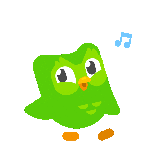
- Encouragement to Engage: Ever noticed how confetti explodes when you complete a task in certain apps, like Duolingo or TikTok? It’s like the app is saying, “You did it! You rock!” These small rewards can keep users coming back, gamifying their experience without being overbearing.

Micro-interactions: The Quiet Heroes of User Retention
Let’s face it, there are a lot of apps out there. So many, in fact, that users have endless options to choose from. How do you keep someone coming back to your app instead of wandering off to the next shiny thing? Micro-interactions.
For example, imagine you’re using a finance app, and every time you reach your savings goal, you get a fun little animation of a piggy bank filling up with coins. It might seem minor, but that visual pat on the back can make a big difference in how users feel about the app. People love positive reinforcement — it’s why we give each other high-fives, and it’s why apps give us these little bursts of fun.

Apps like Facebook and Instagram have been leveraging micro-interactions for years to increase user engagement. In fact, studies show that users tend to spend more time on platforms with well-executed micro-interactions. Why? Because they’re engaging without being overwhelming.
The Not-So-Micro Impact on Business

Sure, micro-interactions are fun, but they’re also good for business. By improving the user experience, they lead to higher retention rates, increased user engagement, and better brand loyalty. The more users enjoy your app, the more likely they are to stay, recommend it to friends, and spend more time (and money) within it.
Take Duolingo, for example. Their use of celebratory animations when you complete a lesson keeps users coming back day after day. It’s no surprise that their user retention rate is through the roof. Duolingo’s micro-interactions motivate users to keep learning, without feeling like they’re grinding through another boring language lesson.
The Flip Side: Micro-interactions Gone Wrong
Of course, micro-interactions aren’t perfect. When overdone or poorly executed, they can quickly become annoying. Remember those old Flash websites from the early 2000s where everything had to animate? Buttons wiggled, text glowed, and every hover effect was like a mini fireworks display. Yeah, that was too much.

The trick is subtlety. Micro-interactions should enhance the experience, not distract from it. No one wants to be bombarded by sound effects, flashing icons, or confetti for every tiny action. It’s all about finding that sweet spot where the interaction feels natural and effortless.
Let’s Not Forget Accessibility
When designing micro-interactions, it’s important to consider accessibility. What works for some users might not work for everyone. For example, a flashy animation might be delightful to some but distracting or even disorienting to others. Always keep in mind that every user is different, and make sure to offer options for those who might need them.

For instance, providing an option to reduce motion or turn off animations is a great way to ensure that your micro-interactions are inclusive and don’t unintentionally alienate part of your audience.
For further reading on Micro-interactions, consider the following articles:
- The Role of Micro-interactions in Modern UX by The Interaction Design Foundation.
- Micro-interactions in UX: The art of subtlety by UX Magazine.
- Microinteractions in User Experience by Nielsen Norman Group.
- Microinteractions: Enhancing User Experience Through Small Details by Design Lab.
See also our previous article on The Art of Intentional Clutter
Follow us across our social platforms and stay tuned for our next episode
 |
| The UX Times Magazine banner image |


Comments
Post a Comment
Please, leave us a message. We respond as soon as possible